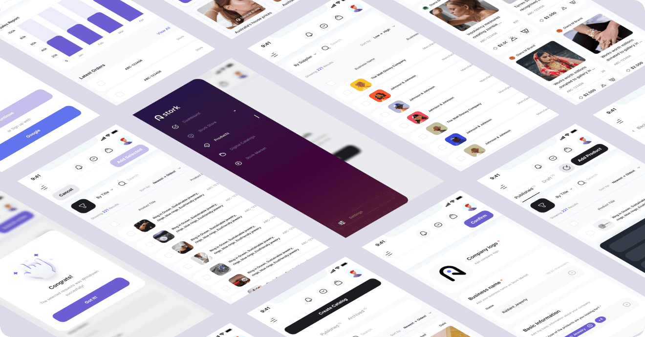
Designing a Better Wholesale Experience for Buyers & Sellers
Designing a Better Wholesale Experience
for Buyers & Sellers
Designing a Better Wholesale Experience for Buyers & Sellers
Role
UI/UX Designer
UI/UX Designer
Client
SaaS / Web App
SaaS / Web App
Timeline
6 Months
6 Months
Tools I used
Figma, Notion, Figjam
Figma, Notion, Figjam
01 UI/UX Design
02 Sass Design
03 Figma
04 Jewellery e Commerce Platform
05 Design System
01 UI/UX Design
02 Sass Design
03 Figma
04 Jewellery e Commerce Platform
05 Design System
About this project
About this project
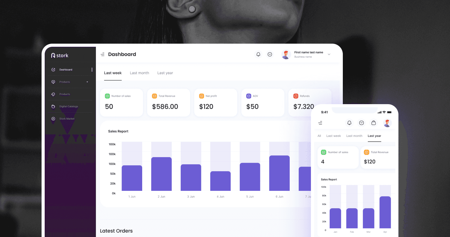
Stork is a B2B wholesale marketplace platform designed to streamline bulk product ordering, store management, and inventory coordination between buyers and sellers. My goal was to create a clean, efficient, and intuitive experience while managing complex inventory, ordering, and buyer/seller coordination.
Stork is a B2B wholesale marketplace platform designed to streamline bulk product ordering, store management, and inventory coordination between buyers and sellers. My goal was to create a clean, efficient, and intuitive experience while managing complex inventory, ordering, and buyer/seller coordination.
Stork is a B2B wholesale marketplace platform designed to streamline bulk product ordering, store management, and inventory coordination between buyers and sellers. My goal was to create a clean, efficient, and intuitive experience while managing complex inventory, ordering, and buyer/seller coordination.
The Problem
Wholesale buying involved too many steps. Buyers found it difficult to quickly find the right products, while sellers didn't have a clear view of their stock or incoming orders. This made the overall buying and selling process harder to manage.
Wholesale buying involved too many steps. Buyers found it difficult to quickly find the right products, while sellers didn't have a clear view of their stock or incoming orders. This made the overall buying and selling process harder to manage.
The Solutions
Created one connected marketplace experience covering product discovery, catalogs, ordering, and payment. Buyers can find products faster through organized catalogs, while sellers can easily track their inventory and orders. A consistent design across the experience makes the entire process easier to understand for both sides.
Created one connected marketplace experience covering product discovery, catalogs, ordering, and payment. Buyers can find products faster through organized catalogs, while sellers can easily track their inventory and orders. A consistent design across the experience makes the entire process easier to understand for both sides.


Understand the realities
Understand the realities
I spent the first on research interviewing buyers and sellers, mapping current workflows, and auditing competitor B2B platforms. The key finding: both user types needed completely different information and tasks, but the platform was trying to serve them with the same interface.
I spent the first on research interviewing buyers and sellers, mapping current workflows, and auditing competitor B2B platforms. The key finding: both user types needed completely different information and tasks, but the platform was trying to serve them with the same interface.
I spent the first on research interviewing buyers and sellers, mapping current workflows, and auditing competitor B2B platforms. The key finding: both user types needed completely different information and tasks, but the platform was trying to serve them with the same interface.
I designed two distinct experience streams:
one optimised for buyers (fast discovery → clear pricing → quick checkout) and one optimised for sellers (easy listing management → clear order pipeline → actionable analytics).
I designed two distinct experience streams:
one optimised for buyers (fast discovery → clear pricing → quick checkout) and one optimised for sellers (easy listing management → clear order pipeline → actionable analytics).
I designed two distinct experience streams:
one optimised for buyers (fast discovery → clear pricing → quick checkout) and one optimised for sellers (easy listing management → clear order pipeline → actionable analytics).
Research & Insights
Research & Insights
Buyer
Buyer
Needs fast product discovery
Prefers clear pricing and bulk deals
Slow ordering, missing product details
Needs fast product discovery
Prefers clear pricing and bulk deals
Slow ordering, missing product details
Seller
Seller
Needs an organized inventory system
Wants to track revenue and analytics
Too many steps to update stock
Key Research Insights
Key Research Insights
Buyers depend heavily on filters and quick views
Sellers need real-time performance insights
Mobile usage among buyers was higher than expected
Sellers needed multi-product upload support
Challenge
Challenge
Wholesale shoppers struggled with: difficulty finding trusted sellers, slow/fragmented ordering process, unclear return and dispute policies, inconsistent product listings across sellers.
Wholesale shoppers struggled with: difficulty finding trusted sellers, slow/fragmented ordering process, unclear return and dispute policies, inconsistent product listings across sellers.
Difficulty finding relevant products
Slow, fragmented ordering process
Unclear stock visibility
Difficulty finding relevant products
Slow, fragmented ordering process
Unclear stock visibility
Sellers faced:
Sellers faced:
No clear analytics for performance
Complicated product management
Poor visibility of order lifecycle
No clear analytics for performance
Complicated product management
Poor visibility of order lifecycle
Product Goal
Product Goal
Create a modern SaaS platform to increase order volume, reduce seller onboarding time, and introduce analytics that drive better decision-making.
Create a modern SaaS platform to increase order volume, reduce seller onboarding time, and introduce analytics that drive better decision-making.
Build a streamlined, easy-to-use wholesale dashboard
Improve discoverability of products
Provide powerful analytics for sellers
Reduce friction in the ordering and stock-management flows
Establish a clean, premium visual identity for the brand
Build a streamlined, easy-to-use wholesale dashboard
Improve discoverability of products
Provide powerful analytics for sellers
Reduce friction in the ordering and stock-management flows
Establish a clean, premium visual identity for the brand
Key Design Decisions
Key Design Decisions
Scattered discovery → Structured catalogs
Scattered discovery → Structured catalogs
Scattered discovery → Structured catalogs
Problem
Problem
Buyers had to search through a large and unorganized product list to find what they needed.
Buyers had to search through a large and unorganized product list to find what they needed.
Design Decision
Design Decision
Created organized product catalogs along with a dedicated Stork Market discovery experience.
Created organized product catalogs along with a dedicated Stork Market discovery experience.
Result
Result
Buyers can find relevant products faster without searching through a long list.
Buyers can find relevant products faster without searching through a long list.
Blind inventory to Real-time visibility
Blind inventory to Real-time visibility
Blind inventory to Real-time visibility
Problem
Problem
Sellers didn't have one place to check their current stock or incoming orders.
Sellers didn't have one place to check their current stock or incoming orders.
Design Decision
Design Decision
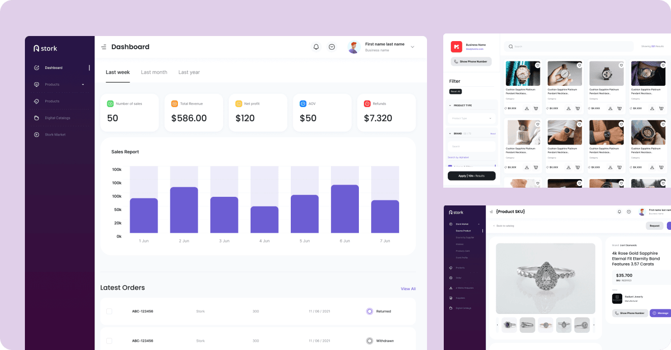
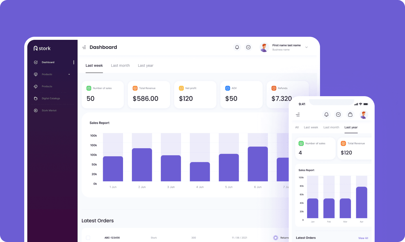
Created a centralized dashboard showing inventory levels and order updates in one place.
Created a centralized dashboard showing inventory levels and order updates in one place.
Result
Result
Sellers can quickly see what's in stock and what needs attention.
Sellers can quickly see what's in stock and what needs attention.
Separate payment → Integrated checkout
Separate payment → Integrated checkout
Separate payment → Integrated checkout
Problem
Problem
Integrated payment directly into the same flow as product selection and ordering.
Integrated payment directly into the same flow as product selection and ordering.
Design Decision
Design Decision
Payment felt disconnected from the rest of the buying experience, making the final step feel less seamless.
Payment felt disconnected from the rest of the buying experience, making the final step feel less seamless.
Result
Result
Buyers can move smoothly from choosing products to completing their order.
Buyers can move smoothly from choosing products to completing their order.
Final Design
Final Design
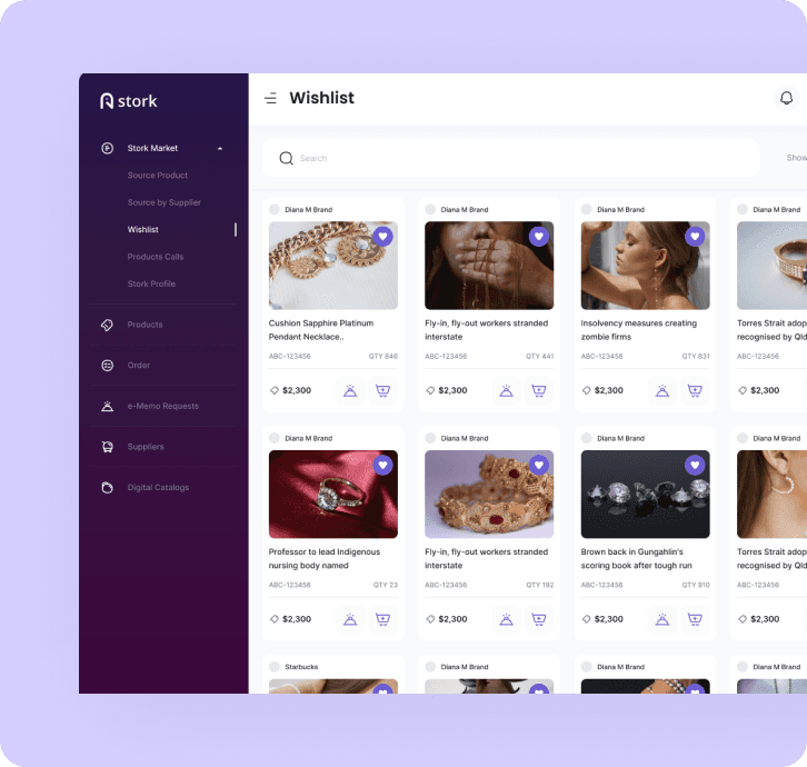
Wishlist, Stork Market discovery, sign-in, and order management — all sharing one dark, premium interface system across buyer and seller sides.
Wishlist, Stork Market discovery, sign-in, and order management — all sharing one dark, premium interface system across buyer and seller sides.
Wishlist, Stork Market discovery, sign-in, and order management — all sharing one dark, premium interface system across buyer and seller sides.
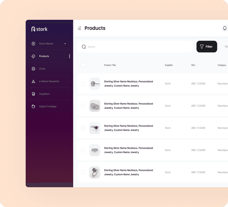
Products List
Products List
Buyers can easily compare, filter, and favorite products in a visually organized layout.
Buyers can easily compare, filter, and favorite products in a visually organized layout.
Buyers can easily compare, filter, and favorite products in a visually organized layout.
User Problem:
Buyers are browsing product options and saving favorites.
User Problem:
Buyers are browsing product options and saving favorites.
Solutions:
Previously, buyers had to manually request catalogs or sift through spreadsheets.
Solutions:
Previously, buyers had to manually request catalogs or sift through spreadsheets.
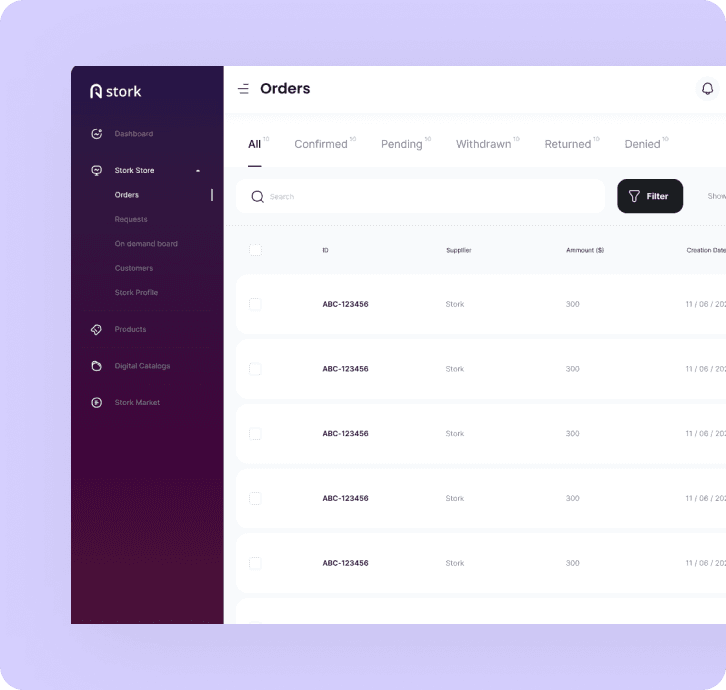
Order Management Screen
Order Management Screen
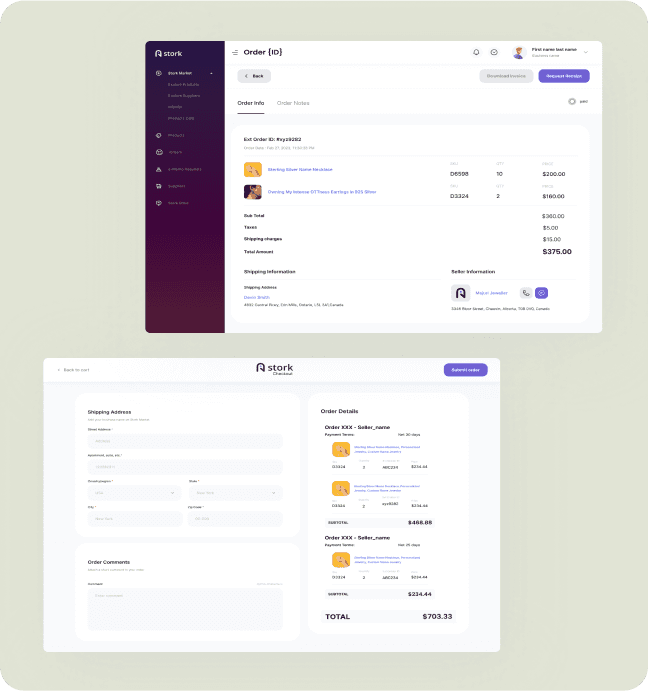
Sellers receive buyer requests and can instantly approve, reject, or modify orders.
Sellers receive buyer requests and can instantly approve, reject, or modify orders.
Sellers receive buyer requests and can instantly approve, reject, or modify orders.
User Problem:
Sellers receive and manage orders from multiple buyers.
User Problem:
Sellers receive and manage orders from multiple buyers.
Solutions:
A clear, centralized view of all orders streamlines processing and reduces errors.
Solutions:
A clear, centralized view of all orders streamlines processing and reduces errors.
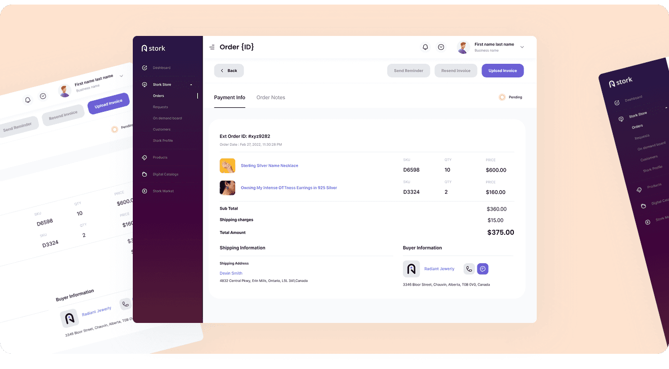
Payment & Invoicing
Payment & Invoicing
Streamlined payment flow with real-time receipt generation and order confirmation.
Streamlined payment flow with real-time receipt generation and order confirmation.
Streamlined payment flow with real-time receipt generation and order confirmation.
User Problem:
Sellers prepare invoices and share payment receipts with buyers and Manual payment handling led to tracking issues and delayed processing.
User Problem:
Sellers prepare invoices and share payment receipts with buyers and Manual payment handling led to tracking issues and delayed processing.
Solutions:
Automated payment tracking ensures transparency and faster transaction cycles..
Solutions:
Automated payment tracking ensures transparency and faster transaction cycles..
Digital Catalogs
Digital Catalogs
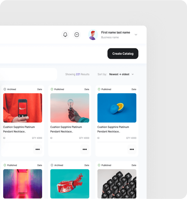
Sellers can create, edit, and manage product listings with complete metadata and visuals.
Sellers can create, edit, and manage product listings with complete metadata and visuals.
Sellers can create, edit, and manage product listings with complete metadata and visuals.
User Problem:
Manual product listing and catalog updates were time-consuming
User Problem:
Manual product listing and catalog updates were time-consuming
Solutions:
Real-time product updates enhance visibility and reduce dependency on offline communication.
Solutions:
Real-time product updates enhance visibility and reduce dependency on offline communication.
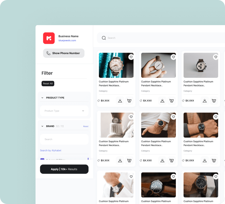
Stork Market Directory
Stork Market Directory
Buyers explore supplier listings and directly engage with preferred partners.
Buyers explore supplier listings and directly engage with preferred partners.
Buyers explore supplier listings and directly engage with preferred partners.
User Problem:
Buyers explore all listed sellers and connect based on their preferences.
User Problem:
Buyers explore all listed sellers and connect based on their preferences.
Solutions:
A searchable marketplace opens new business channels and scalable growth.
Solutions:
A searchable marketplace opens new business channels and scalable growth.
Results & Impact
Results & Impact
Buyers reach relevant products faster through structured catalogs, and sellers get a live, trustworthy view of orders and inventory instead of managing it outside the platform.
Buyers reach relevant products faster through structured catalogs, and sellers get a live, trustworthy view of orders and inventory instead of managing it outside the platform.
24%
24%
Reduction in
order processing time
Reduction in
order processing time
Reduction in
order processing time
18%
18%
Increase in
buyer satisfaction
Increase in
buyer satisfaction
Increase in
buyer satisfaction
20%
20%
Increased repeat
order rate
Increased repeat
order rate
Increased repeat
order rate
27%
27%
Improved order management efficiency
Improved order management efficiency
Improved order management efficiency
Behind the Design
Behind the Design
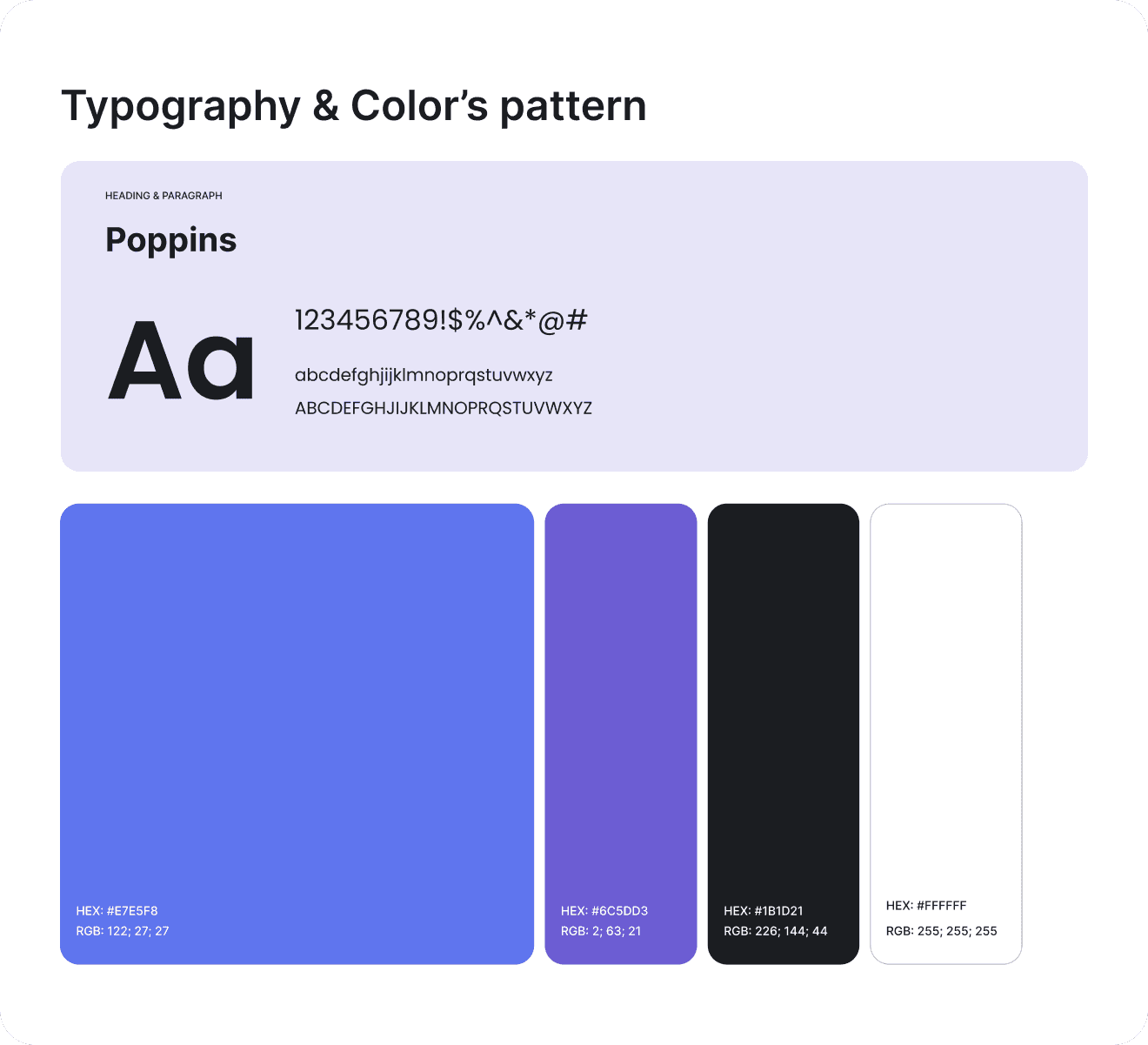
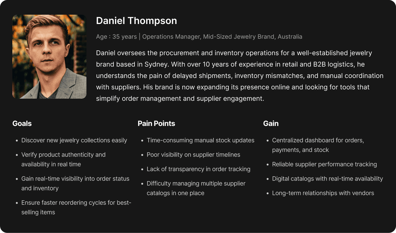
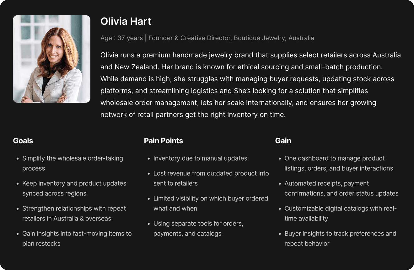
Two personas — Olivia Hart (buyer) and Daniel Thompson (seller) — anchored every decision, since their goals rarely overlapped. Typography used Poppins throughout, paired with a dark purple and black palette that reads as modern, professional SaaS rather than a generic marketplace.
Two personas — Olivia Hart (buyer) and Daniel Thompson (seller) — anchored every decision, since their goals rarely overlapped. Typography used Poppins throughout, paired with a dark purple and black palette that reads as modern, professional SaaS rather than a generic marketplace.
Two personas — Olivia Hart (buyer) and Daniel Thompson (seller) — anchored every decision, since their goals rarely overlapped. Typography used Poppins throughout, paired with a dark purple and black palette that reads as modern, professional SaaS rather than a generic marketplace.
User Persona
User Persona
User Persona
User Flows
User Flows
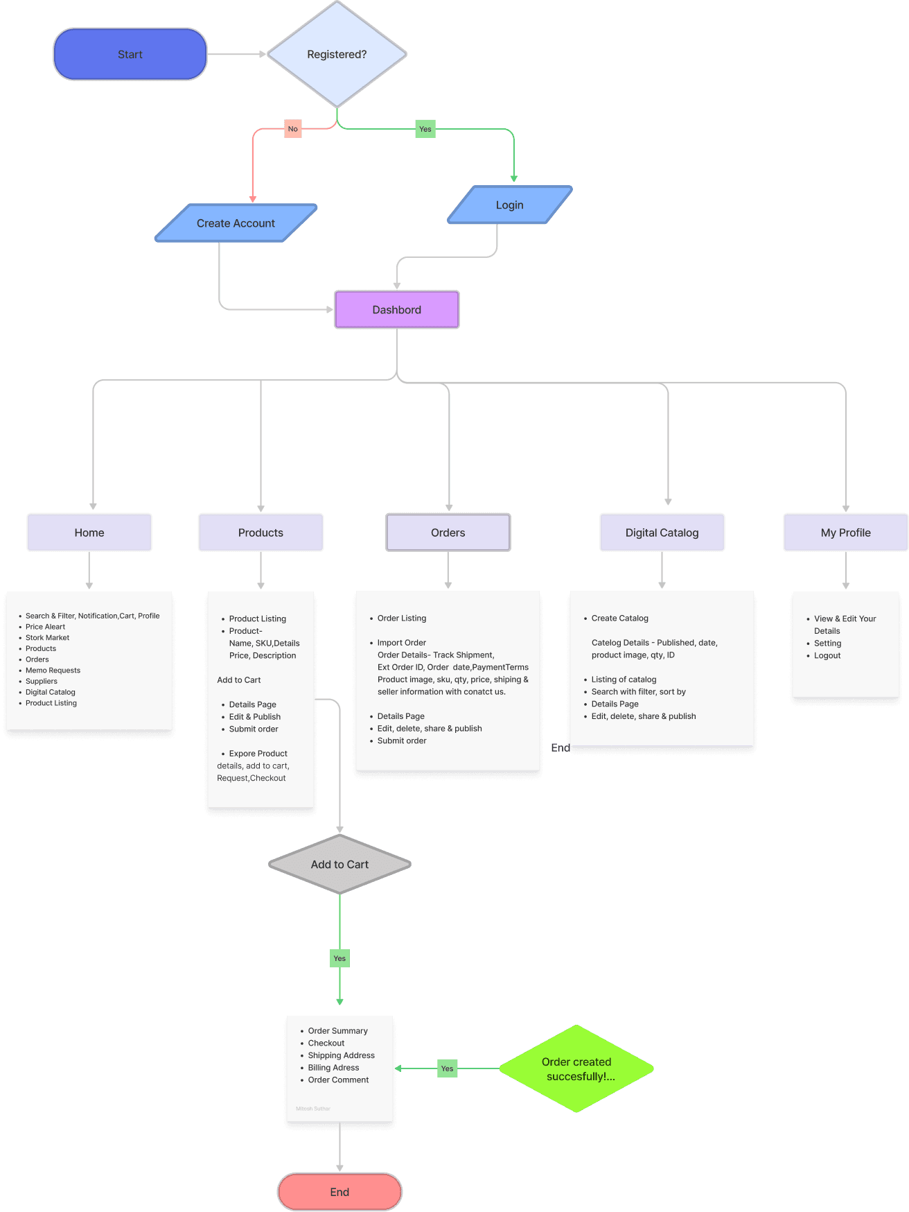
Buyer's Flow
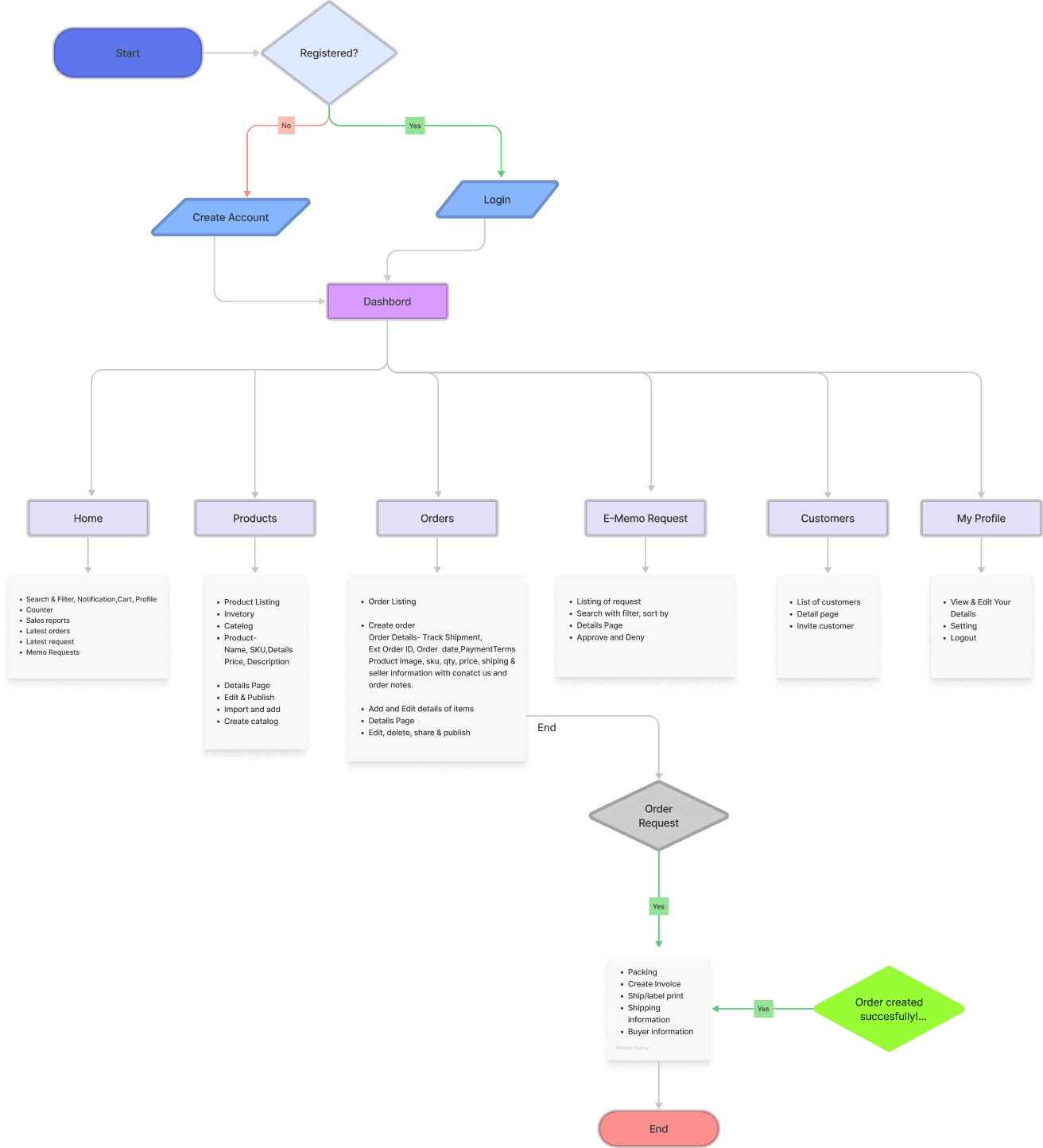
Seller's Flow
Design System
Design System
A design system built for two distinct user types sharing one visual language — clean data-dense layouts for sellers managing orders, and card-based discovery layouts for buyers browsing catalogues.
A design system built for two distinct user types sharing one visual language — clean data-dense layouts for sellers managing orders, and card-based discovery layouts for buyers browsing catalogues.
A design system built for two distinct user types sharing one visual language — clean data-dense layouts for sellers managing orders, and card-based discovery layouts for buyers browsing catalogues.