Opera Lafayette — Redesigning
the Opera Experience
Opera Lafayette — Redesigning
the Opera Experience
Opera Lafayette — Redesigning
the Opera Experience
Service
UI/UX Design
UI/UX Design
Client
Washington DC
Platform
Re-design Website
Re-design Website
01 Branding
02 Redesign Website
03 Figma
04 Opera Lafayette
05 Design System
01 Branding
02 Redesign Website
03 Figma
04 Opera Lafayette
05 Design System
About this project
About this project
About this project
Opera Lafayette wanted to modernize their website to improve ticket sales and make their rich performance catalog easier to explore. The old site had scattered information, an outdated visual system, and a confusing ticket-buying flow.
Opera Lafayette wanted to modernize their website to improve ticket sales and make their rich performance catalog easier to explore. The old site had scattered information, an outdated visual system, and a confusing ticket-buying flow.
I redesigned the end-to-end experience with a focus on clarity, easier navigation, and a modern, conversion-focused visual system — while staying true to Opera Lafayette's classical identity.
I redesigned the end-to-end experience with a focus on clarity, easier navigation, and a modern, conversion-focused visual system — while staying true to Opera Lafayette's classical identity.
Problem
Opera Lafayette's site buried its own best asset — the performances themselves. Show details, schedules, and seats were hard to find, the layout was text-heavy and visually flat, and the ticket flow felt disconnected from the elegance of the brand it was selling. The result: patrons browsed, got lost, and left.
Opera Lafayette's site buried its own best asset — the performances themselves. Show details, schedules, and seats were hard to find, the layout was text-heavy and visually flat, and the ticket flow felt disconnected from the elegance of the brand it was selling. The result: patrons browsed, got lost, and left.
Solution
Solution
A full redesign built around three ideas: surface the shows immediately, let imagery carry the emotion, and make buying a ticket feel as confident as the brand itself. Navigation went shallow, the homepage went cinematic, and the path from browsing to booked got dramatically shorter.
A full redesign built around three ideas: surface the shows immediately, let imagery carry the emotion, and make buying a ticket feel as confident as the brand itself. Navigation went shallow, the homepage went cinematic, and the path from browsing to booked got dramatically shorter.
Team
Client
Me & Developer
Timeline
3 week
Tools
Figma, Notion
Understanding opera realities
Understanding opera realities
I started with a full audit of the existing site, mapping the user journey from homepage to checkout. I then benchmarked against The Met Opera, the Royal Opera House, and Broadway.com to identify what high-performing cultural sites do differently.
I started with a full audit of the existing site, mapping the user journey from homepage to checkout. I then benchmarked against The Met Opera, the Royal Opera House, and Broadway.com to identify what high-performing cultural sites do differently.
I started with a full audit of the existing site, mapping the user journey from homepage to checkout. I then benchmarked against The Met Opera, the Royal Opera House, and Broadway.com to identify what high-performing cultural sites do differently.
Five critical insights shaped the entire redesign:
Five critical insights shaped the entire redesign:
Five critical insights shaped the entire redesign:
60% of users visited only the performance pages
Users couldn't find the season calendar without clicking through 4+ pages
Ticket CTAs were buried mid-page
Event pages had no video, no cast info, no press reviews
The mobile experience was effectively unusable, despite 35% of traffic coming from phonesuild emotional desire
Mobile experience was broken — 35% of traffic came from phones
60% of users visited only the performance pages
Users couldn't find the season calendar without clicking through 4+ pages
Ticket CTAs were buried mid-page
Event pages had no video, no cast info, no press reviews
The mobile experience was effectively unusable, despite 35% of traffic coming from phonesuild emotional desire
Mobile experience was broken — 35% of traffic came from phones
60% of users visited only the performance pages
Users couldn't find the season calendar without clicking through 4+ pages
Ticket CTAs were buried mid-page
Event pages had no video, no cast info, no press reviews
The mobile experience was effectively unusable, despite 35% of traffic coming from phonesuild emotional desire
Mobile experience was broken — 35% of traffic came from phones
Research Insights
Research Insights
Homepage: Show discovery front and centre
Homepage: Show discovery front and centre
I moved the current season and upcoming performances into the hero section — the first thing every visitor sees. Show cards display the title, date, venue, and a "Buy Tickets" button in a single glance. No more hunting.
I moved the current season and upcoming performances into the hero section — the first thing every visitor sees. Show cards display the title, date, venue, and a "Buy Tickets" button in a single glance. No more hunting.
Rebuilt performance pages
Rebuilt performance pages
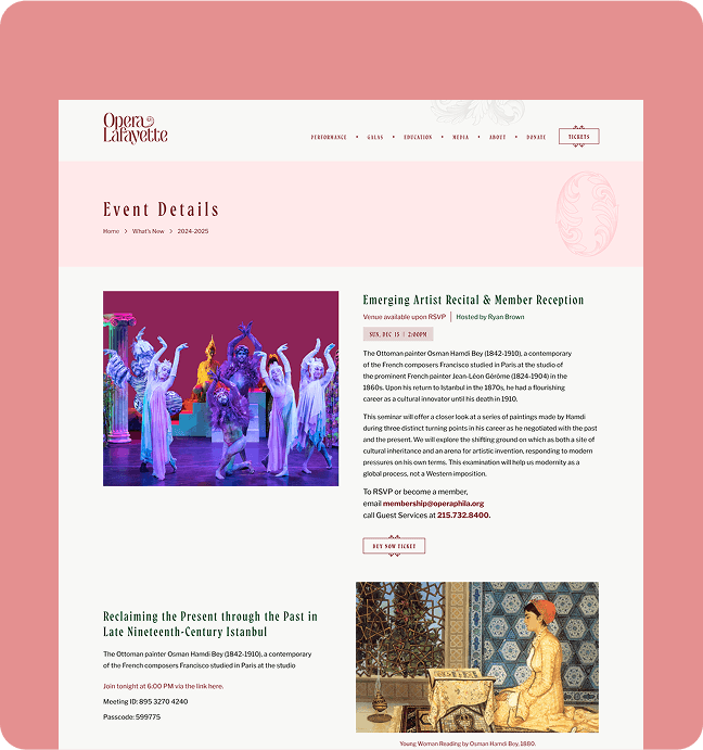
Each performance page was rebuilt with a trailer embed, cast biographies, pull quotes from press reviews, and a historical background section for new audiences. The insight: theater audiences are emotionally driven.
Each performance page was rebuilt with a trailer embed, cast biographies, pull quotes from press reviews, and a historical background section for new audiences. The insight: theater audiences are emotionally driven.
Sticky "Buy Tickets" CTA
Sticky "Buy Tickets" CTA
The ticket call-to-action now follows the user as they scroll through every show page. This single change was the single biggest driver of the conversion improvement.
The ticket call-to-action now follows the user as they scroll through every show page. This single change was the single biggest driver of the conversion improvement.
Simplified navigation
Simplified navigation
I collapsed "Performances / Events / Tickets / Schedule" into one clean navigation structure. Users now reach their destination in 2 clicks instead of 5.
I collapsed "Performances / Events / Tickets / Schedule" into one clean navigation structure. Users now reach their destination in 2 clicks instead of 5.
Mobile-first rebuild
Mobile-first rebuild
All layouts were rebuilt for mobile: large touch targets, vertical card layouts, and a checkout flow that works one-handed.
All layouts were rebuilt for mobile: large touch targets, vertical card layouts, and a checkout flow that works one-handed.
Key Design Decisions
Key Design Decisions
Key Design Decisions
Buried navigation → Simple, direct navigation
Buried navigation → Simple, direct navigation
Buried navigation → Simple, direct navigation
Problem
Problem
Important information like performances and tickets was buried under multiple layers. Visitors had to click around before finding what they needed.
Important information like performances and tickets was buried under multiple layers. Visitors had to click around before finding what they needed.
Design Decision
Design Decision
Simplified the navigation into five clear sections, keeping performances and ticketing easy to reach from the homepage.
Simplified the navigation into five clear sections, keeping performances and ticketing easy to reach from the homepage.
Result
Result
Visitors can get from the homepage to the right performance or ticket page with fewer steps.
Visitors can get from the homepage to the right performance or ticket page with fewer steps.
Text-heavy pages → More visual storytelling
Text-heavy pages → More visual storytelling
Text-heavy pages → More visual storytelling
Problem
Problem
The website relied heavily on text and didn't capture the atmosphere and emotion of a live performance.
The website relied heavily on text and didn't capture the atmosphere and emotion of a live performance.
Design Decision
Design Decision
Used large, high-quality performance photography across key pages, with supporting content placed around the visuals.
Used large, high-quality performance photography across key pages, with supporting content placed around the visuals.
Result
Result
The website feels more engaging and gives visitors a stronger sense of the experience before they even attend.
The website feels more engaging and gives visitors a stronger sense of the experience before they even attend.
Disconnected checkout → A smoother checkout experience
Disconnected checkout → A smoother checkout experience
Disconnected checkout → A smoother checkout experience
Problem
Problem
The ticketing experience felt separate from the main website, which made the transition to payment feel less consistent.
The ticketing experience felt separate from the main website, which made the transition to payment feel less consistent.
Design Decision
Design Decision
Created a simple step-by-step flow for selecting tickets, choosing seats, checking out, and confirming the booking — all within the same visual style.
Created a simple step-by-step flow for selecting tickets, choosing seats, checking out, and confirming the booking — all within the same visual style.
Result
Result
The booking experience feels like a natural part of the website instead of a separate process.
The booking experience feels like a natural part of the website instead of a separate process.
Unclear ticket availability → Clear availability at a glance
Unclear ticket availability → Clear availability at a glance
Unclear ticket availability → Clear availability at a glance
Problem
Problem
Visitors couldn't easily tell which performances still had tickets available without opening each one.
Visitors couldn't easily tell which performances still had tickets available without opening each one.
Design Decision
Design Decision
Added clear ticket-status labels directly to performance cards so availability was visible before clicking.
Added clear ticket-status labels directly to performance cards so availability was visible before clicking.
Result
Result
Visitors can quickly see what's available and focus on performances they can actually book.
Visitors can quickly see what's available and focus on performances they can actually book.
Final Design
Final Design
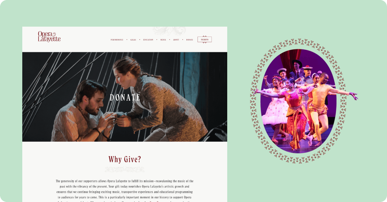
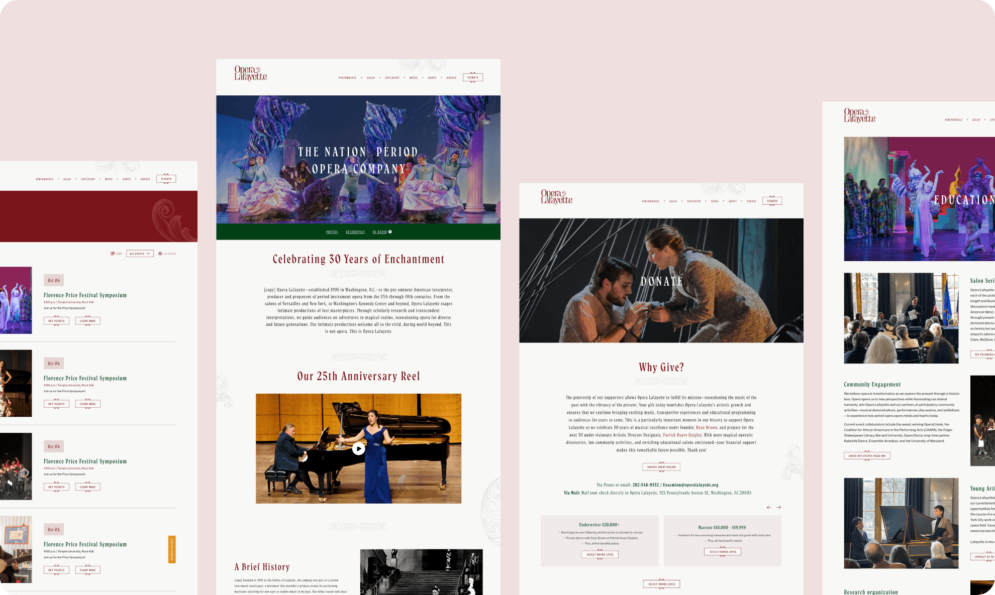
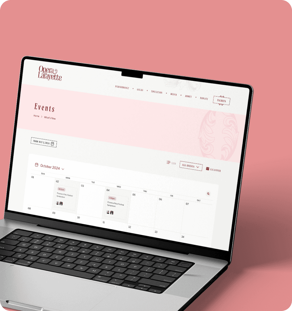
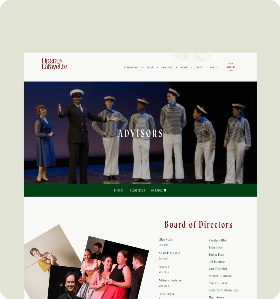
The visual aesthetics are designed to captivate, inspire, and engage. Whether through dynamic imagery, refined layouts, or elegant typography, every element is thoughtfully crafted to enhance the storytelling experience.
The visual aesthetics are designed to captivate, inspire, and engage. Whether through dynamic imagery, refined layouts, or elegant typography, every element is thoughtfully crafted to enhance the storytelling experience.
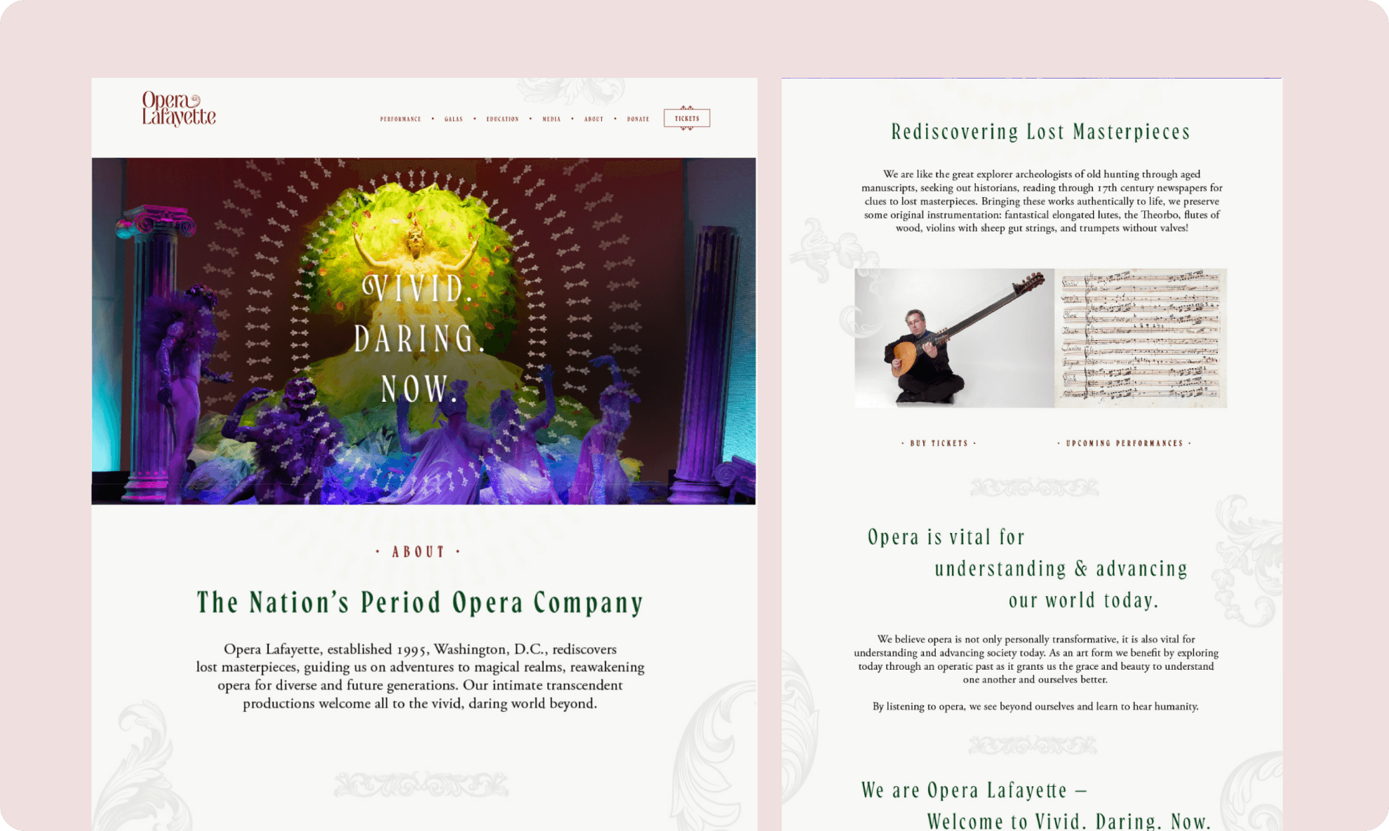
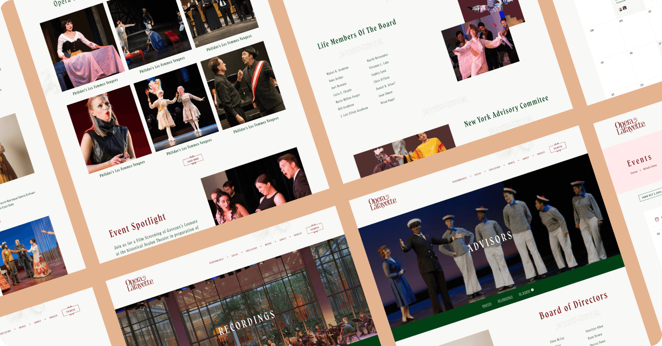
Homepage hero, performance pages, and the full ticket-purchase flow — all sharing one cinematic visual language from first click to confirmation.
Homepage hero, performance pages, and the full ticket-purchase flow — all sharing one cinematic visual language from first click to confirmation.
Results & Outcome
Results & Outcome
A find what's playing and book a seat in a fraction of the previous steps. The visual-first homepage and shallow navigation removed the "getting lost" problem that was driving people away before they ever reached a ticket page.
A find what's playing and book a seat in a fraction of the previous steps. The visual-first homepage and shallow navigation removed the "getting lost" problem that was driving people away before they ever reached a ticket page.
18%
Increase in ticket booking Sales
24%
Faster ticket purchase
30%
Improvement in event discovery
Behind the Design
Behind the Design
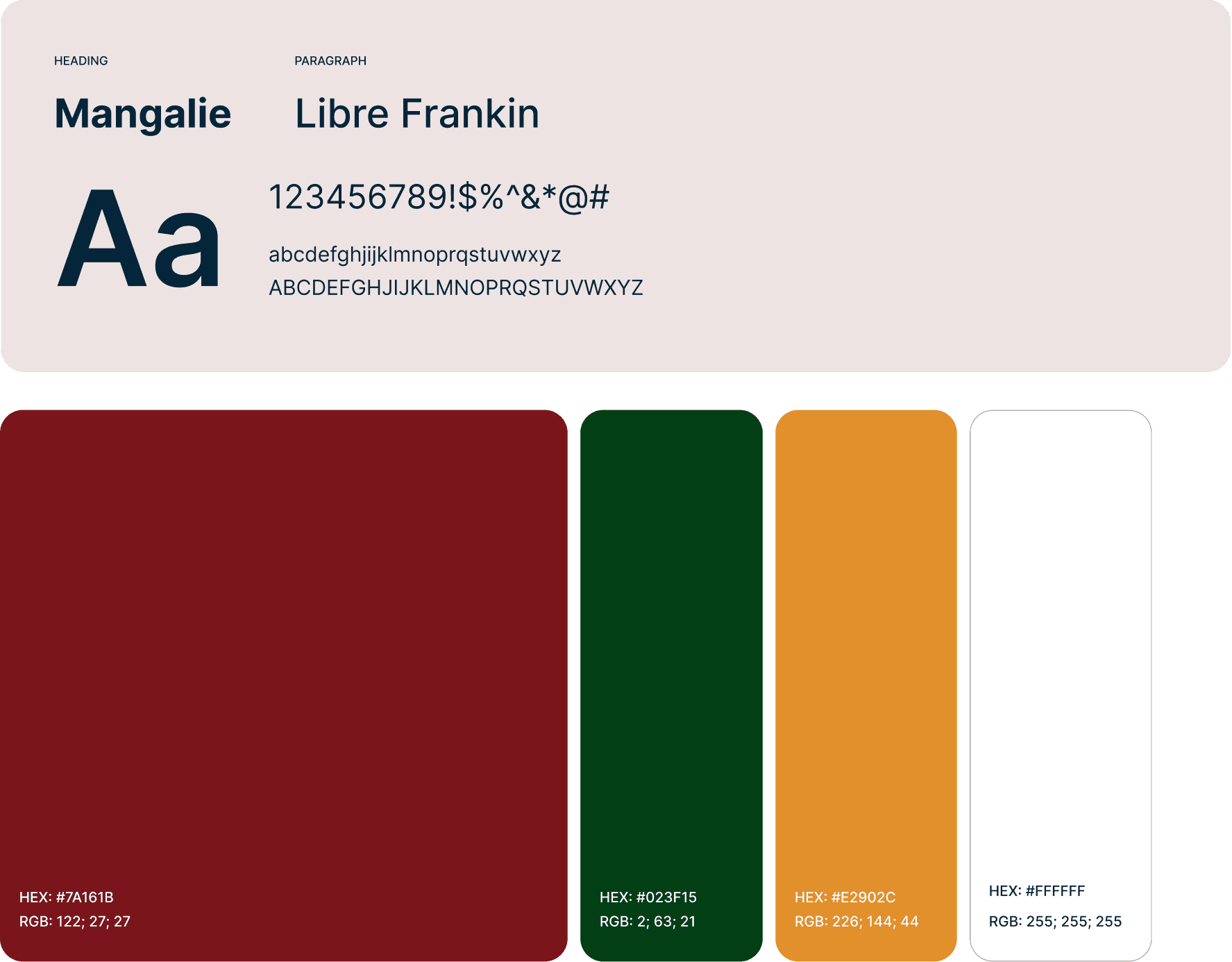
Competitive benchmarking against Royal Opera House and Broadway (hero imagery, mobile experience, social proof) surfaced the visual-storytelling gap — it wasn't a hunch, it was the clearest pattern in the research. Typography paired Mangalie for headlines with Libre Franklin for body, against a warm red/green/orange palette that kept the classical tone intact while feeling current.
Competitive benchmarking against Royal Opera House and Broadway (hero imagery, mobile experience, social proof) surfaced the visual-storytelling gap — it wasn't a hunch, it was the clearest pattern in the research. Typography paired Mangalie for headlines with Libre Franklin for body, against a warm red/green/orange palette that kept the classical tone intact while feeling current.
UX Strategy
UX Strategy
Simplify Navigation
Simplify Navigation
I combined multiple result with “Performances / Events / Tickets / Schedule” pages into one streamlined structure.
I combined multiple result with “Performances / Events / Tickets / Schedule” pages into one streamlined structure.
Visual Storytelling
Visual Storytelling
Lead every page with large performance photography rather than text blocks, to communicate the emotional experience of live opera
Lead every page with large performance photography rather than text blocks, to communicate the emotional experience of live opera
Increase Conversion Confidence
Increase Conversion Confidence
Clear pricing, seat availability, and trust signals (reviews, past sold-out shows) visible before checkout
Clear pricing, seat availability, and trust signals (reviews, past sold-out shows) visible before checkout
Style Guide
Style Guide
A refined visual system built around Opera Lafayette's classical identity — warm neutrals, elegant serif typography for headlines, and generous imagery that lets the performances speak for themselves."
A refined visual system built around Opera Lafayette's classical identity — warm neutrals, elegant serif typography for headlines, and generous imagery that lets the performances speak for themselves."